Tuesday, December 3, 2013

Cigarette Boxes

    Over the course of the Thanksgiving break I came to the conclusion that neither of the two previous box templates would work out the way that I expected them to. So I set out to find a new box template and decided to stick with an elongated cigarette box. Finding a template for this design is so difficult that in the end I have decided to just create my own.
    I was able to find a few regular sized cigarette box templates but none were leading me in the direction that I wanted to pursue. However, thanks to another blogger, I was able to atleast find a starting point in creating the template. I must thank blogger MENTESABIERTAS777 for posting their own created template in their Cigarette Pack Template post. This was the basis for my own creation :). Once I work out all the kinks I will post my template on here for all to see.


Thursday, November 21, 2013

Flimsy Pasta Boxes

 Pasta is supposed to be flimsy, NOT the box. Many people have the huge problem of keeping the box of spaghetti noodles closed and the next time they reach to grab the box, noodles go everywhere!!!! Why do pasta companies continue to putther product in such unreliable boxes?
   For my product redesign I'm going to redesign the box that contains the family favorite, spaghetti. I have already found a few box templates for the new design, just haven't decided which one I prefer the best.

The Matchbox design:


The Hexagonal Box design:


Redoing Your Brand

   Every now and then we all purchase a product that just has a not so pretty looking form of packaging.  Not necessarily just talking about the container that it comes in, but also the way the packaging looks as well. From the logo to the entire design concept, bad packaging products do exist and it some of the worst ones that we all tend to fall in love with. Usually some of these products go through a full company redesign and come out looking so much better. Fortunately, this project is to redesign a product that doesn't yet know it needs to be redone. The following are a few redesigns we've seen over the years.


Tuesday, November 19, 2013

The End of a Dramatic Episode

   After losing my flash drive as a final dramatic twist in my Series of Unfortunate Events and not being able to print my project I attempted to do one last recreation of my book design. Compared to my previous attempt this is one I must say I am in love with and it looks appropriate for both an adult book and one of such historic recognition :)


A Series of Unfortunate Events part 2...

  After forgetting to save my 4 hours of work progress that put all my previous sketches together, I have decided to go with a more simplistic design to make my deadline. The following still uses one of my initial sketches however, it looks very childish to me and its not something I am very proud to present or even put my name on :(


A Series of Unfortunate Events

 Like one of my great book series, I have experienced a dramtic Series of Unfortunate Events throughout my term of completeing this project. As previously stated i am working on a book cover design for The Iliad. Over time my progress has been up and down and quiet stressful. The following are my initial sketches and designs from my first attempt.


Thursday, November 7, 2013

Progress & Horses

  So far I have come up with a pretty cool design for my book cover. Again I have chosen to do Homer's The Iliad, an epic poem on the Battle of Troy. When most people think of this book and its story the main thing that comes to mind is the "Trojan Horse". So why not put a big wooden horse on the cover?!?!? Simple, right?
  NO!! Simple is not what I have in mind for this magnificent cover. Simple is far from the term that would describe the concept that I have in mind.
  This cover will have a multitude of elements to depict the storyline and will display the well known scene of the Greeks pushing and pulling this massive wooden horse into the gates of Troy. Hopefully I can get everything done that I plan. First thing first.....learn to draw a horse (not a stick figure, but a close to real looking horse.)


(not bad aye!)

Thursday, October 31, 2013

Homer's The Iliad, the Movie!!!


    In 2004, Director Wolfgang Petersen directed and released the movie titled Troy. This movie is a great representation of Homer's The Iliad. It mainly illustrates the more adventurous and gruesome side of the epic poem but it does such a great job at doing so. Even better Petersen chose such remarkable actors for all of the main characters that each gave the book life through the movie. If reading the book is not your thing check out the link below for a quick synopsis of the movie and the book (sort of). Enjoy!

Book Covers

  Book covers are the essential part of a book that grabs a reader's attention (other than the synopsis or the first 2 pages, depending on the type of reader you are). It is through the cover that many profound readers can tell whether or not the book itself will be a good read. If you're anything like me, the book cover will be your way of remembering the book based off of whether it was good or not. I'm not so good with remembering names of the books I've read. Over time the name and author slips my mind so remembering the cover is my way of remembering the book in itself.
  It just so happens that one of my favorite books also has both of my favorite book covers. Many books retain more than one cover over time. Harper Lee's To Kill A Mockingbird has multiple covers, but only so many stand out to me and make me want to read the book over again!


   Both of these covers give the reader some insight as to what this story will entail. These two covers are my inspiration on how I want my book cover design for Homer's The Iliad to look and feel to the audience :)

Let's Try This Again

   As stated in my previous blog, it is a bit difficult to keep up with this thing. However, this is a second attempt to keep everyone updated on my curent progress. Let's see how this goes....

  My current project requires me to create a book cover for a book of my choice (from a list that was given to me, of course). Now I am a huge fan of Greek Mythology and the many stories that come along with them, especially the story of Achilles and the Battle of Troy!!! So what other book should I do than Homer's The Iliad?!?!?! Exactly, its the perfect choice.
   There are so many amazing scenes being depicted in this epic poem that its almost impossible to choose from. Hopefully I can just do it SOME justice....


Monday, October 28, 2013

Keeping up with a Blog.....

    Many art professors require their students to start a blog in order to keep up with their progress on different projects. It is also an easy way to keep one's portfolio updated and at easy access. Unfortunately, it is extremely hard to keep up with a blog. Having a blog is a lot of responsibility. I'm not saying that many of us are irresponsible, I'm just saying we are all at our own levels of busy.
   Trying to remembering to update a blog every time we sketch something out or do more work to a project is like trying to remember if you turned the coffee pot off this morning before running out the door. Its not impossible but its a bit difficult.
   Now, I'm not making up an excuse as to why I haven't updates my blog since my first project and I'm just finishing the third, I'm simply asking for a little bit of understanding and forgiveness :)

Sunday, September 22, 2013

The Top 3....

  This will be a short post where you won't have to hear about any inspiration or excess irrelevant info about the current project that I'm working on. This is just to let you know of the top 3 designs that have been chosen to a possible logo for your's truely. After careful consideration and many different inputs from both my classmates and other peers I have narrowed it down to the following three designs.....
Out of these three I can only have 2. One as an illustrative logo and one as a typographical logo. So far the bottom two are my favorite and seem to be the ones that I can work with the most. Guess its really time to get to work ^_^

The Digital Era

    After coming up with many different hand drawn sketched and ideas for my logo, it was time to get on the computer and try out a few new programs. In my case, this was Adobe Illustrator. Over the years I have only really worked with Photoshop when it came to my work. However for this project and in this class I am required to learn and master the complicated cousin of my long time friend Photoshop....Illustrator. Although the two pretty much have some of the same tools, I must say Illustrator has grown on me. Yes, I am a fast learner and I love learning new programs, but the challenge of this new program is one that can slightly irritate you at times :). The good thing is once you get the hang of it, its like discovering a new way of riding a bike....but BETTER!!!
   After sitting at my work station for a few hours I was able to master the pen tool and come up with these pretty decent designs.

 
Whether or not any of these will be used is a good question. However there are a few that have grown on me and that I hope to develop a bit more to see their possibility. I guess the only thing left to do now is keep working :)

Thursday, September 19, 2013

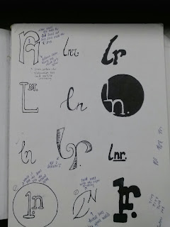
The Best of the Best (or so I thought) !!

    Its very hard to remember to post things on this blog thingy when you are completely tied up between work and school. Being a college student is definitely about learning to manage your time no matter how well you think you've mastered it. Thus the biggest challenge every person has to accomplish!
    After going through my second round of sketches posted earlier this month, I was able to narrow it down to 12 sketches that I 'thought' were the best of the best. HOWEVER......everyone knows that you must go through a million bads to get to that one good! This post doesn't necessarily display the bads, but it gives you all an insight to how I ended up at the final choice.

(I have also included some of the notes and suggestions that some of my classmates included during a small croup critique that took place in class that day.)

Tuesday, September 3, 2013

Re-do!!!!

So I honestly have to say that I was not proud or comfortable of the work I presented today in class. Mainly because I didn't get to spend as much time on it as I had planned or hoped. So in an attempt to make up for my lack or progress earlier, I have devoted the last 3-4 hours of my time re-doing the assignment and coming up with some better logo designs using my initials. It seems that as of now I just can't stop coming up with ideas (whether good or bad) and I can't help but hope that I will come up with one that better suits both my style and personality! Comments and criticism are very much welcomed :)

 Ahhhh....now that makes me feel so much better!!!


Trademark Logos!


The vast majority of our world today consists of logos for different companies and organizations. These logos help us to determine who is who and what is what in the market. Although just about anyone can get on Microsoft Word and create their own logo, it doesn't make it a good one. A good logo takes time, patience, a creative mind, and a catchy concept that'll make a "good" long lasting memory in a person's mind. Logos such as the Chick-fil-a signature, the McDonald's arch, the AT&T globe, and the Apple....well apple; are ones that have successfully caught the attention of its consumers and also that are considered their trademark.
 
A bad logo is one that does the complete opposite. It is one that neither looks appealing, leaves a good impression, or that portrays a company's purpose/trademark.


Inspired

Andrew Carnegie believed that a little competition every now and then brought the best out of people. That it was the best way to determine who the “top dogs” in anything were. As a student at Georgia State University with high hopes of being accepted into the Graphic Design program, I can say that I truly believe in this quote. Although it took a little longer than most for me to gain this understanding, I have promised to work harder than usual and to stay on my toes in this competition and to allow my classmates to inspire me to be better and work harder.